ABOUT THE PROJECT
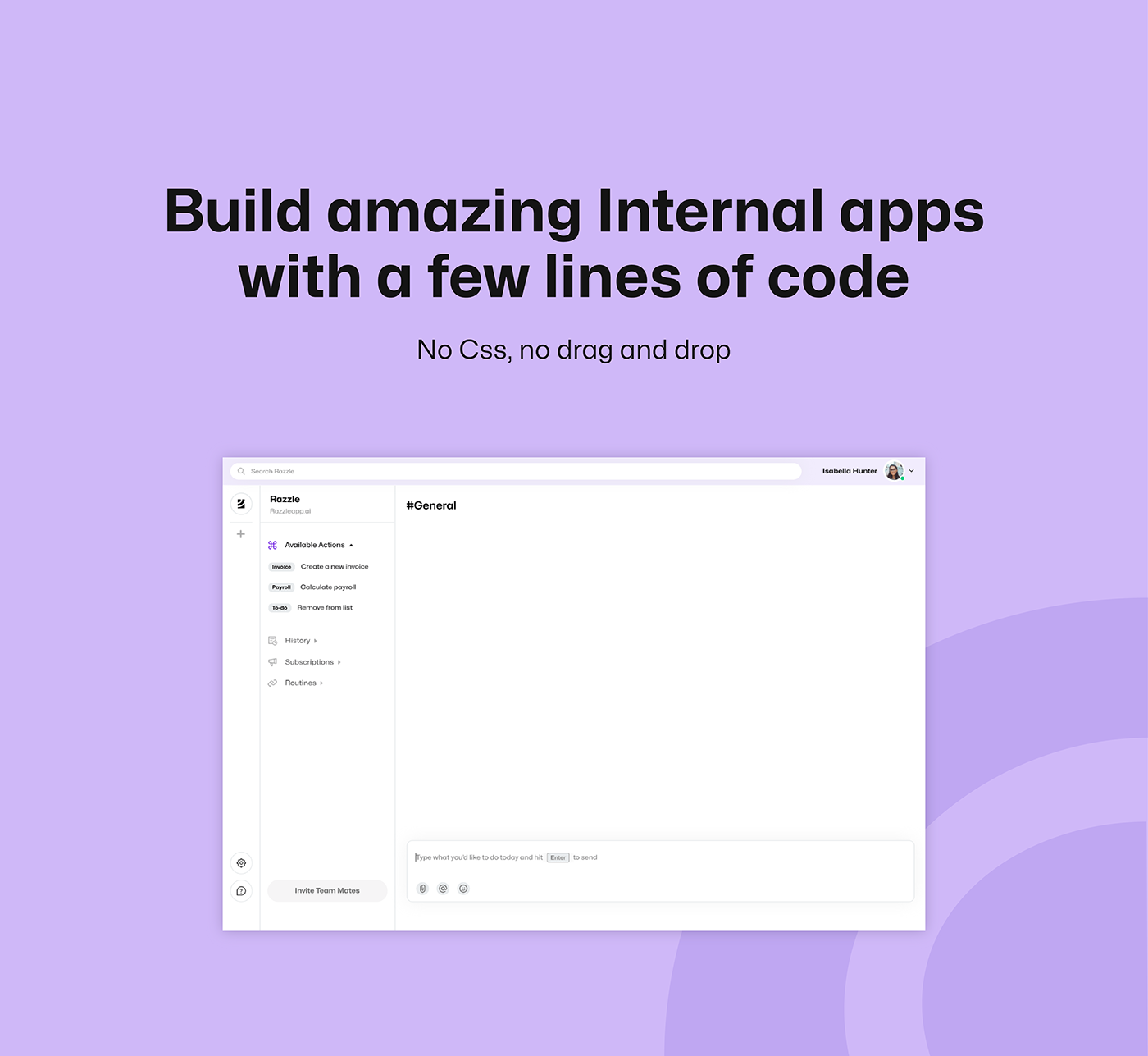
Razzle is a developer tool that allows users to simply describe what they are trying to do in natural language. Razzle uses GPT-3 powered Artificial Intelligence to execute action in your code.
Working directly with my client (Razzle's Co-Founders), I went through all of the key design processes.
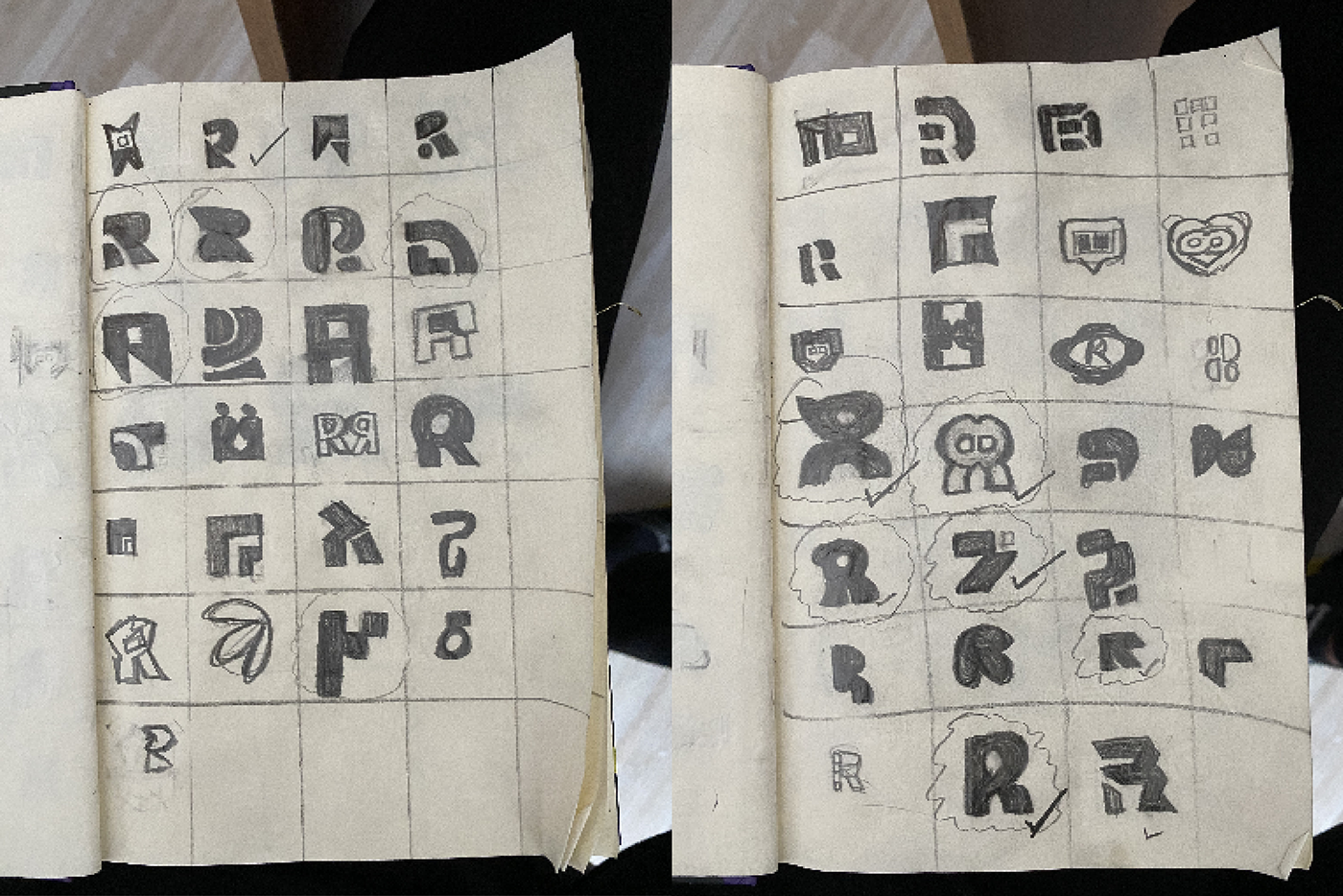
From hosting brand discovery sessions to creating mood boards, where the tone of the brand was defined. I made sketches of logo explorations and sent options over to my clients to choose from. After deciding on the logo and what creative direction to go with, we then finalized. I went on to create vectorized logo versions and a brand guideline book for the company's usage. The Brand Guideline book was the most important deliverable of this project, it took me a couple of weeks to create it.
Why had it taken so long? Well, I had to do a lot of research on how company brand guidelines are made. I am from a Product Design background, so I wasn't familiar with this aspect of documentation. It was a really fun and challenging experience for me.
Razzle's brand identity is based on the concept of "Fast and Simple."
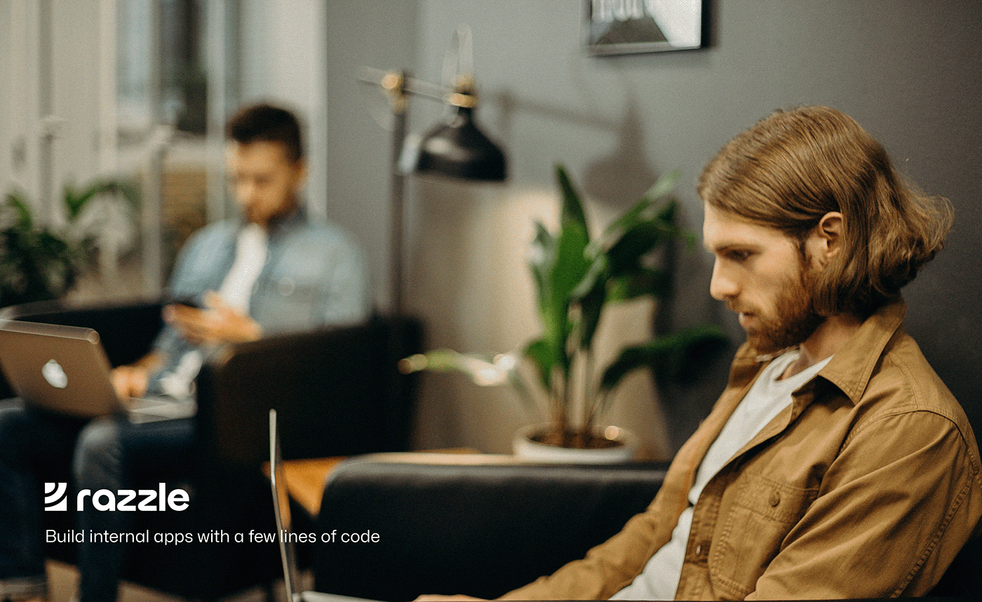
With Razzle, engineering teams can work more quickly and adaptively. knowing that an artificial intelligence system is at their fingertips to build internal applications with just a few lines of code.
If you ever need to create internal applications for your company, make sure to use Razzle in your development processes.

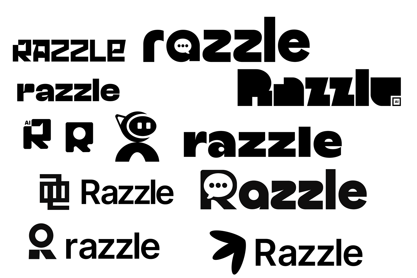
LOGO DESIGN
The logo is a succinct representation of Razzle's brand vision. The logo's bold simplicity reflects abstract design principles. Razzle's logo is a geometric icon based on an abstract letter R composed of a rectangle and two semi circles. It is synonymous with the word Razzle, it can also be used alone


Typeface used for logo mark is an open source font named Chillax, it was created by Indian Type Foundry
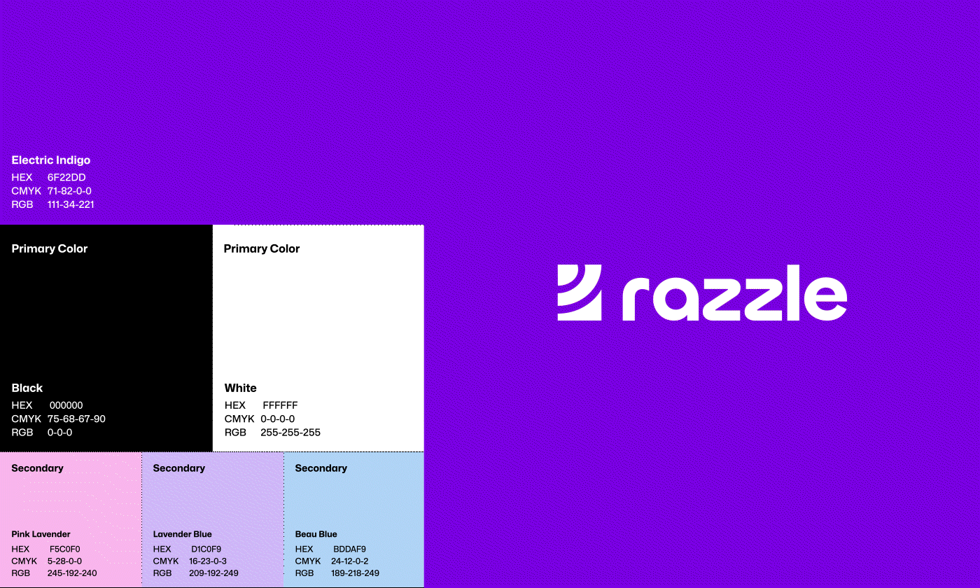
COLOURS
Color is the most impactful and recognizable brand asset. The color scheme is inspired by Razzle's primary brand color, Electric Indigo (Purple). Black, grey, and white add depth to the palette, while Pink Lavender, Lavender Blue, and Beau Blue add versatility in digital applications.


TYPOGRAPHY
Typography is concise, honest, and functional, reflecting Razzle's genuine friendliness. For consistent and bold visual stand out, limited weights were used.
Font Name: Mona Sans by Github


BRAND ASSETS / MERCH


EXCERPTS FROM BRAND GUIDELINE BOOK

LOGO SKETCHES, EXPLORATIONS AND MOODBOARD